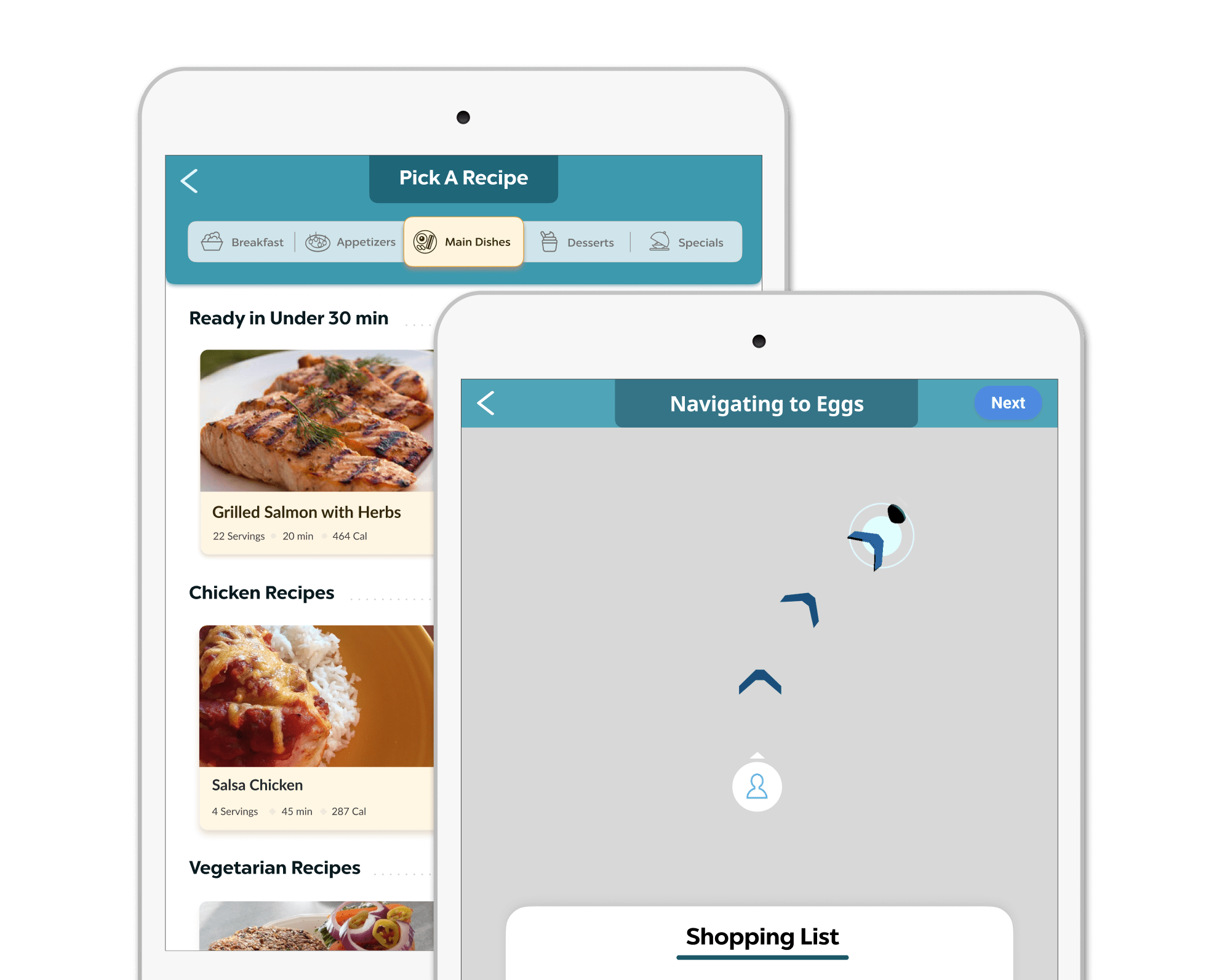

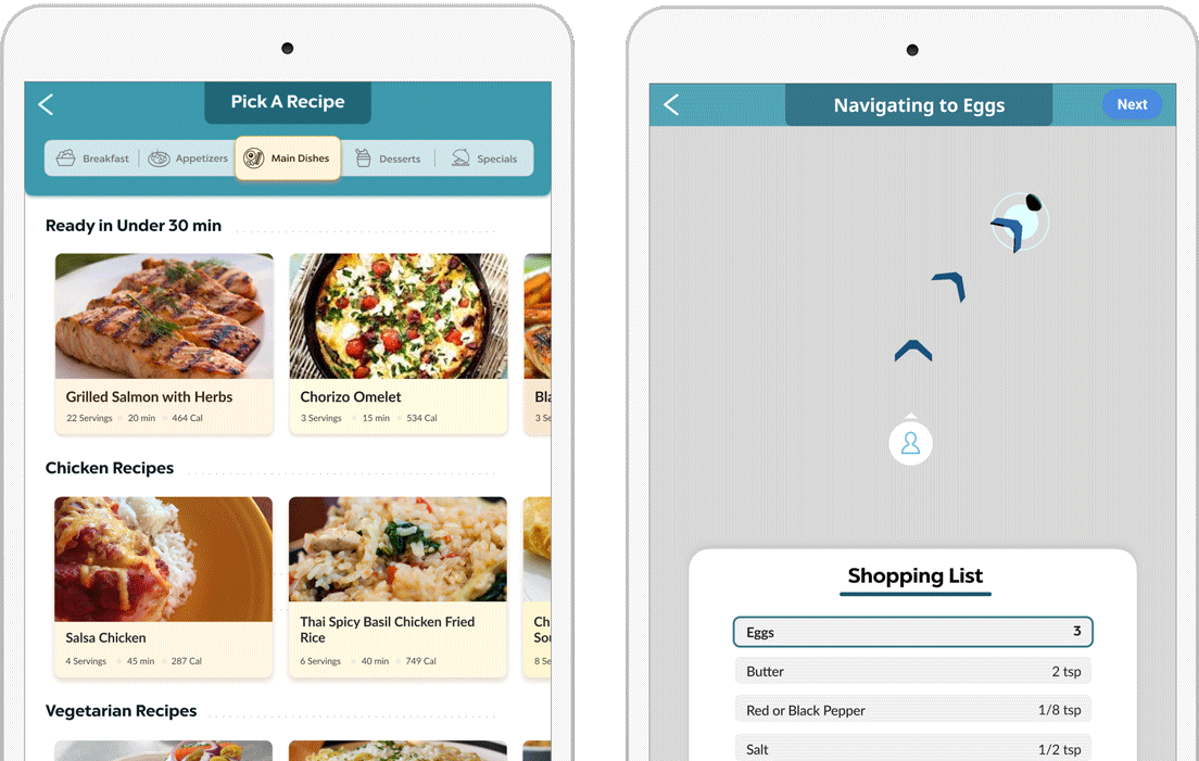
Project Time: 6 weeks (April 2020 to May 2020)
The Problem: Meal Tab does not display recipes in an engaging way or convey its function to a passing customer.
The Solution: I conducted a full redesign of the app to strengthen and improve the experience.
My Role: I was the UX designer in a team of two programmers. I redesigned the app in order to engage customers and spark their curiosity.


As much as 85% of shoppers don't know what they will be cooking tonight, and often it is not something new. The most common way to find something to cook is to save a recipe at home and find the ingredients in store. However, supermarkets are huge and often have a confusing layout which doesn’t make it as intuitive to find new ingredients.
In addition, sometimes users want to choose the product in person before buying, instead of getting it delivered. Could there be an easy way to find new meals to cook and help make the supermarket experience more engaging?
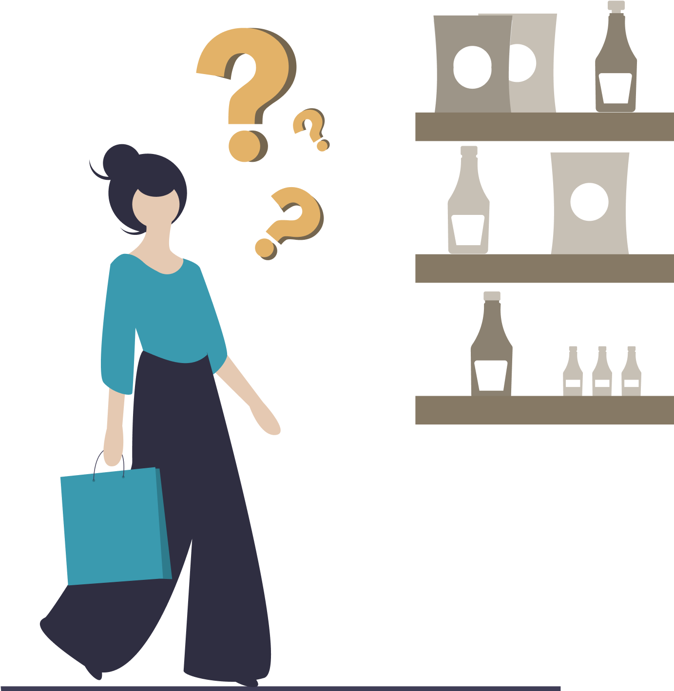

As much as 80% of shoppers don't know what they will be cooking tonight, and often it is not something new. The most common way these days is to look for a recipe at home and try to find the ingredients. However, supermarkets are huge and often have a confusing layout which doesn’t make it as intuitive to find new ingredients.
In addition, sometimes users want to choose their items in person before buying, instead of getting it delivered. Could there be an easier way to find new meals to cook and help make the supermarket experience more engaging?
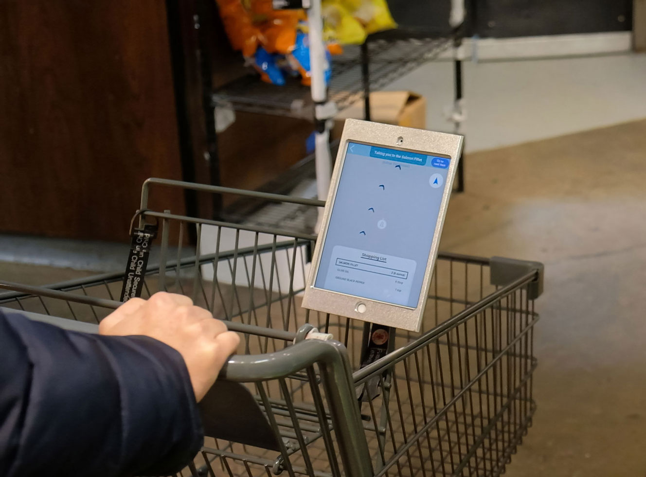
I conducted 100 interviews with my team with random shoppers and discovered that many users found the supermarket experience unintuitive for finding new recipes. We came up with Meal Tab, an app that allows customers to discover new recipes and navigate to all the ingredients in store, helping to inform and empower the shopper to be better cooks. For this project, I was in charge of improving the design of the app so we can eventually start demoing it in store.
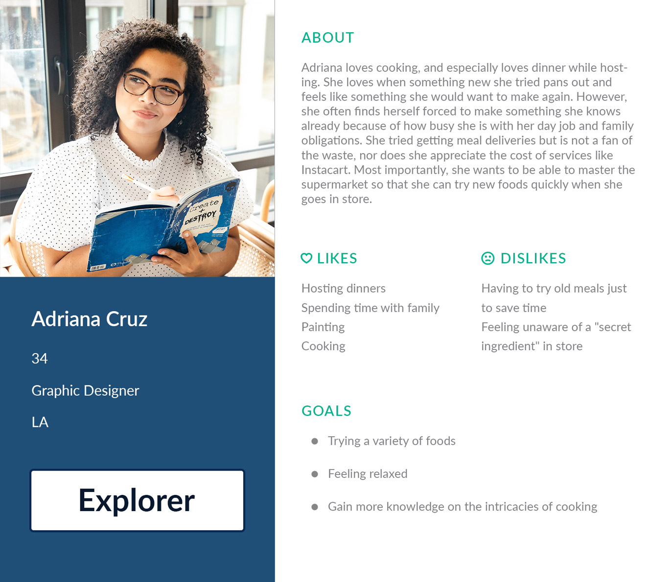
Based on our research, I created two personas to help us get a clearer idea on who our users are. Generally, we found that there are two types of users: the Explorer and the Beginner. They are cooking with different experience levels but they both want to save time and more easily find new delicious meals.

How can we help users find the perfect recipe that suits their need while they're in the supermarket?
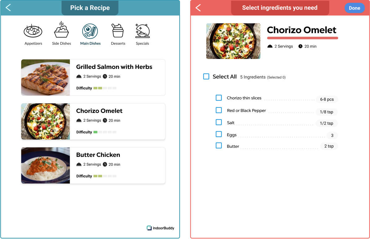
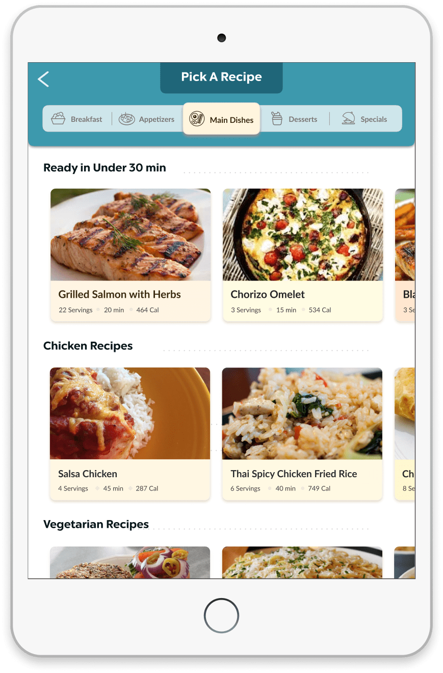
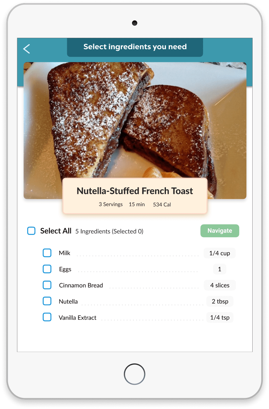
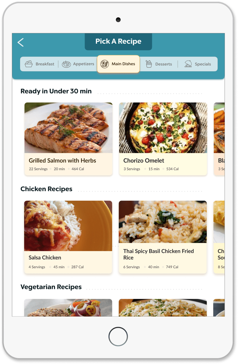
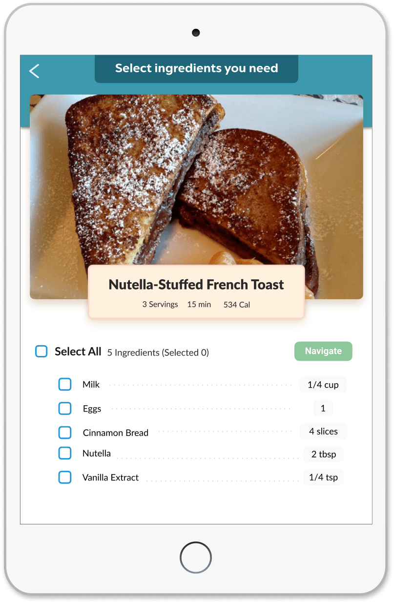
Our old recipe screen with one category worked fine for a small amount of recipes, but it wasn't suitable for a bigger collection. There are so many different types of recipes catering to different needs, and just having one sub-category would make it harder to find the perfect recipe. In addition, we found that the recipe card did not convey enough relevant information.
It was clear that we needed to improve how the recipes are organized.
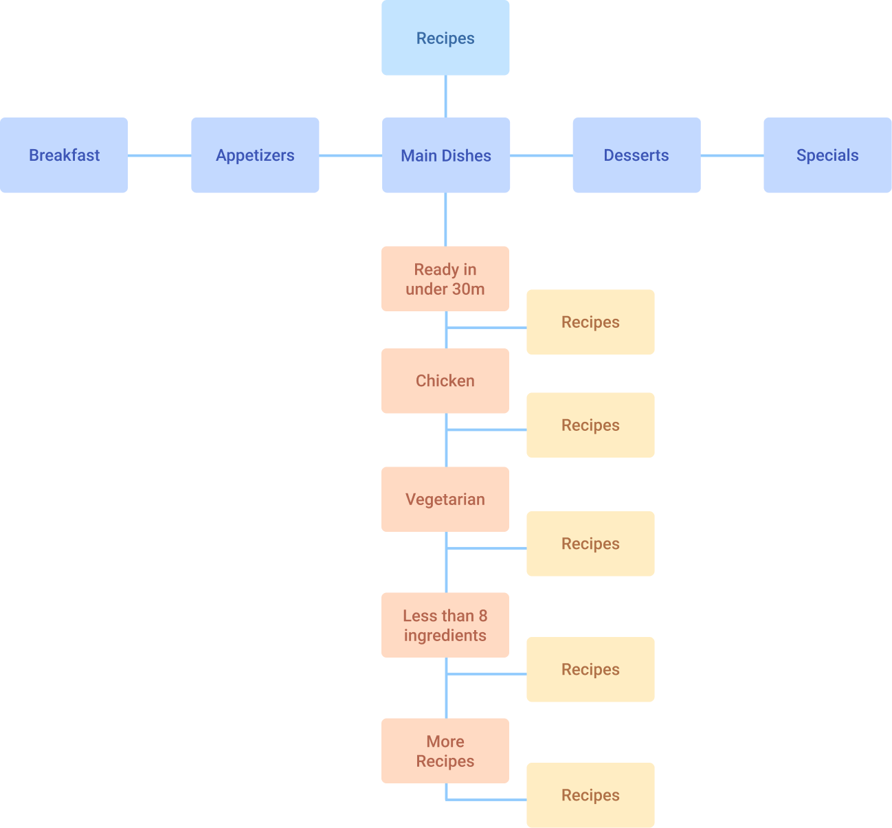
While creating the new information architecture, I considered the fact that there are a lot of ways people filter by recipes, and how it can even vary widely with the same person. A user could be feeling one type of recipe one day and a completely different one the next. This was why I created recipe sub-categories that were diverse and placed them on the same hierarchy.
We wanted to help reduce the customer's time throughout the experience, so I placed recipes under 30 minutes first and ones sorted by ingredients and dietary needs below.
.jpg)

Our old recipe screen with one category worked fine for a small amount of recipes, but it wasn't suitable for a bigger collection. In addition, the recipe card occupied too much space while not conveying enough relevant information.
It was clear that we needed to improve how the recipes are organized.
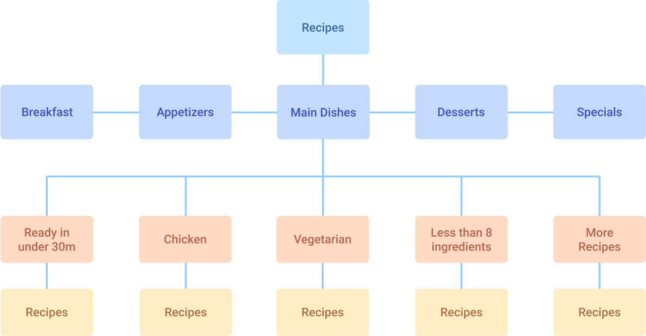
With the new information architecture, I considered the fact that there are various ways people filter by recipes, and how it can even vary widely for the same person. This was why I placed all recipe sub-categories on the same hierarchy.
Our goal was to reduce the customer's time throughout the experience, so I placed recipes under 30 minutes first and recipes sorted by ingredients and dietary needs below.
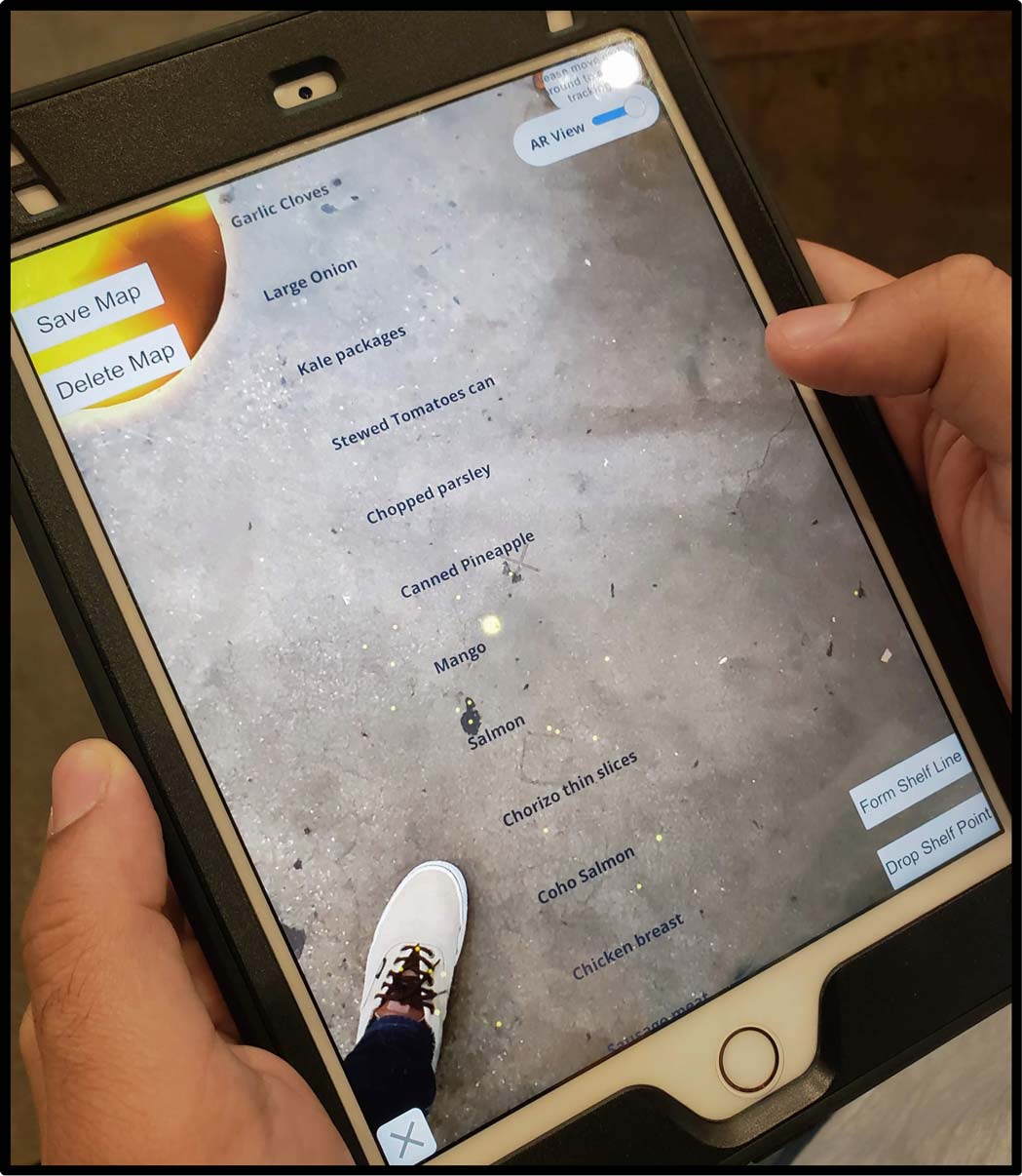
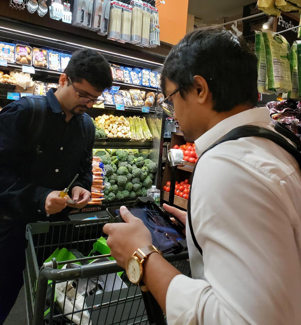
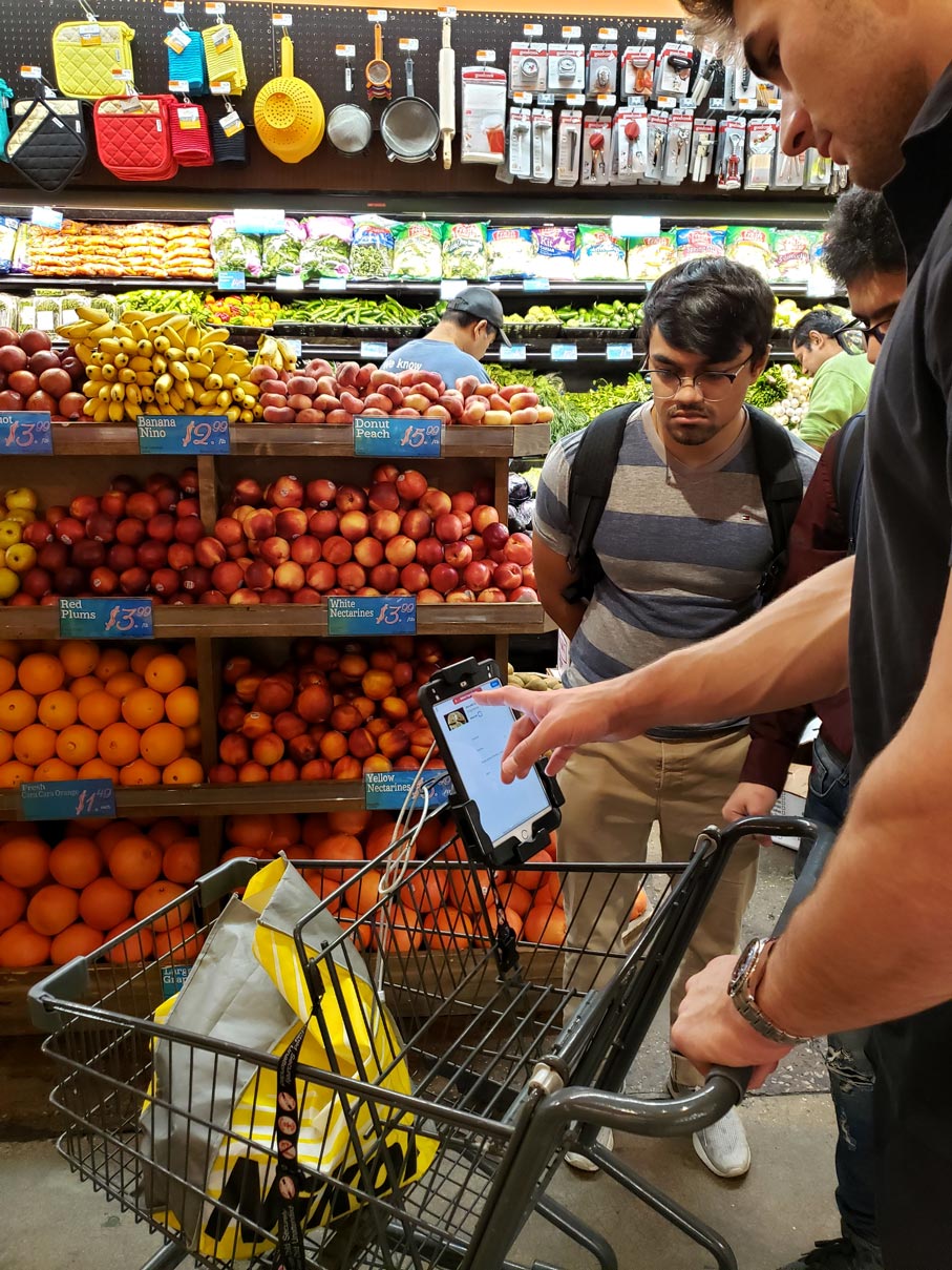
After three weeks, we were finally able to test our product in store. Unfortunately, the testing experience was a complete failure! The product was incredibly buggy, and it was awkward to test it with users while they shop. We were stressed, as we didn't get many opportunities to test in store.
What do we do now?
We went over multiple potential paths forward, such as going back to bug fix and test again, finding another store to test the MVP, or redefining the buggy navigation feature.
Instead, I nudged my team to go back to our primary goal,which was to obtain valuable metrics that validates the experience for store owners. So we decided to ask ourselves a different question.
Would customers even try out the experience in the first place if they saw it in store?
How can Meal Tab catch the attention of shoppers passing by and see if it has something of value for them?
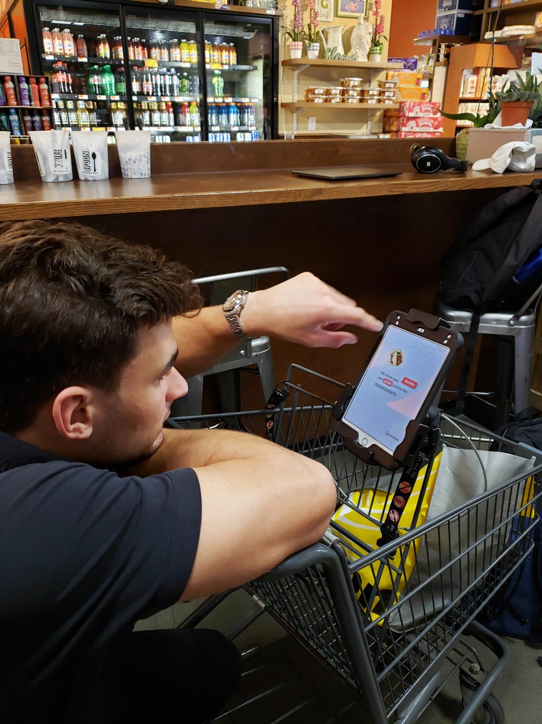
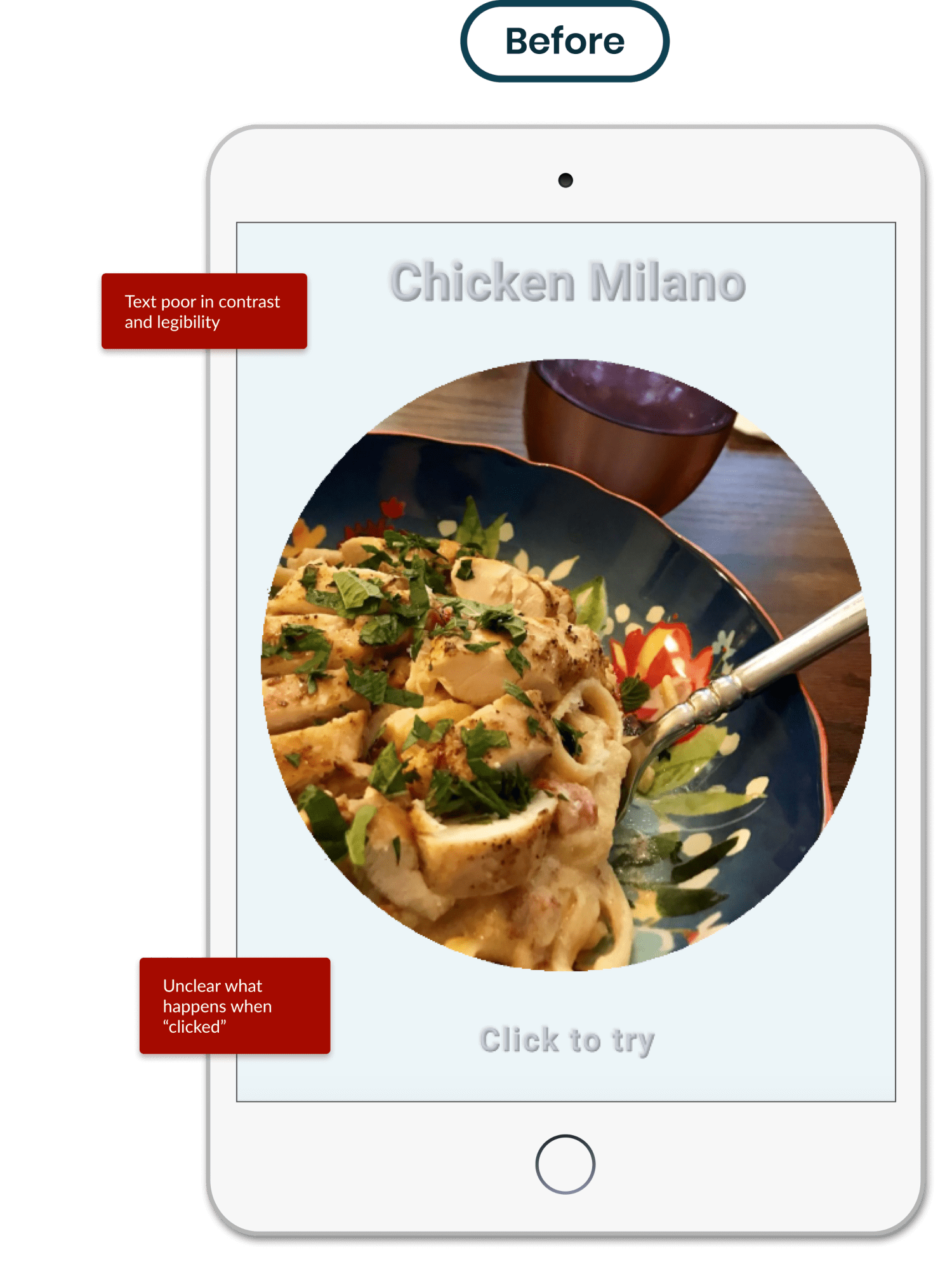
Meal Tab existed as a demo app on a tablet near the front of the store for user testing, where customers could pick it up and magnetically attach it to their shopping cart. My goal was to redesign the welcome screen to catch users attention, while informing them just enough so that they have a good idea on what the app is about.
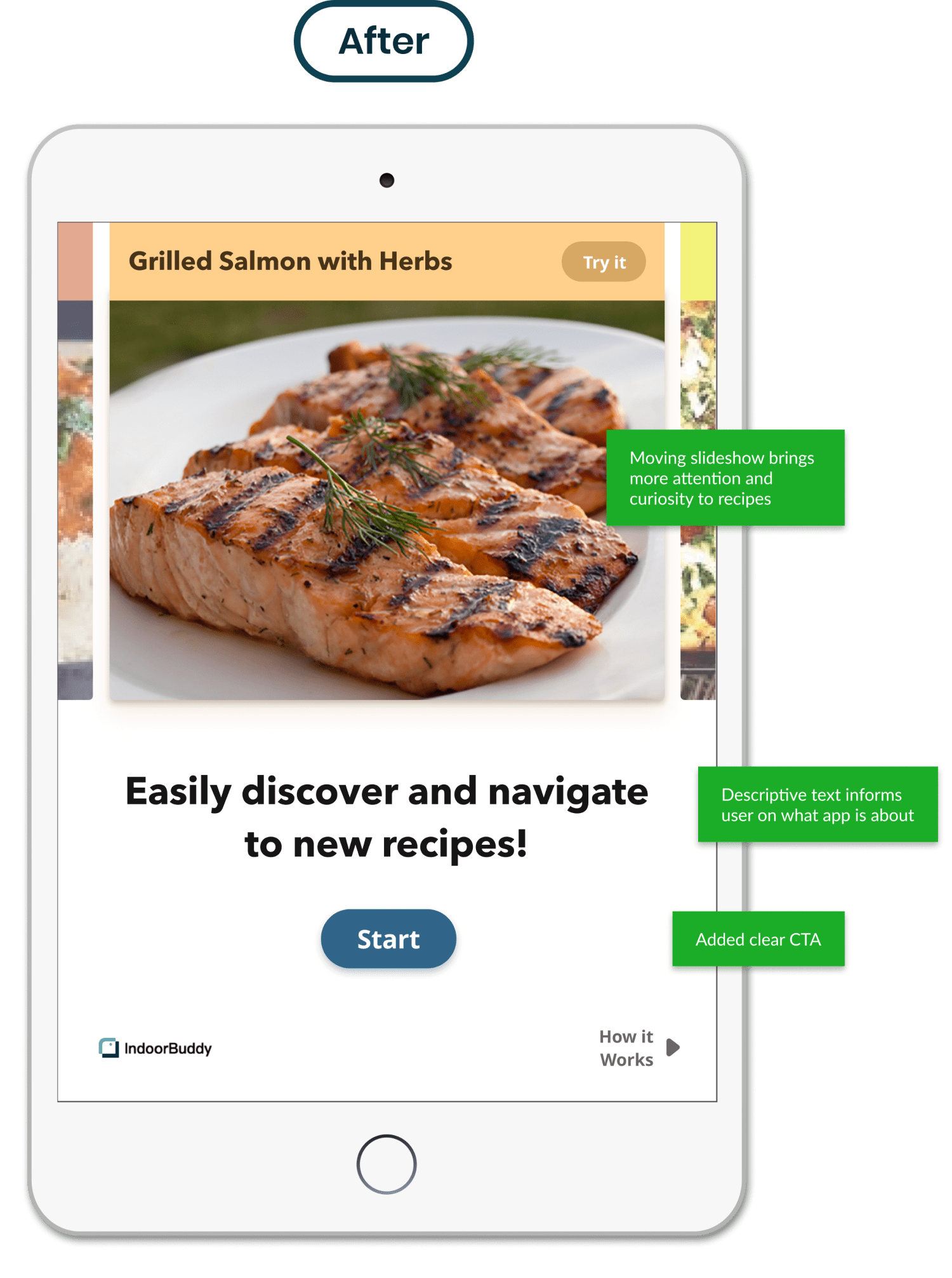
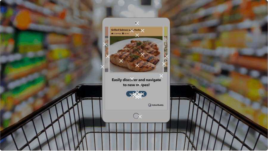
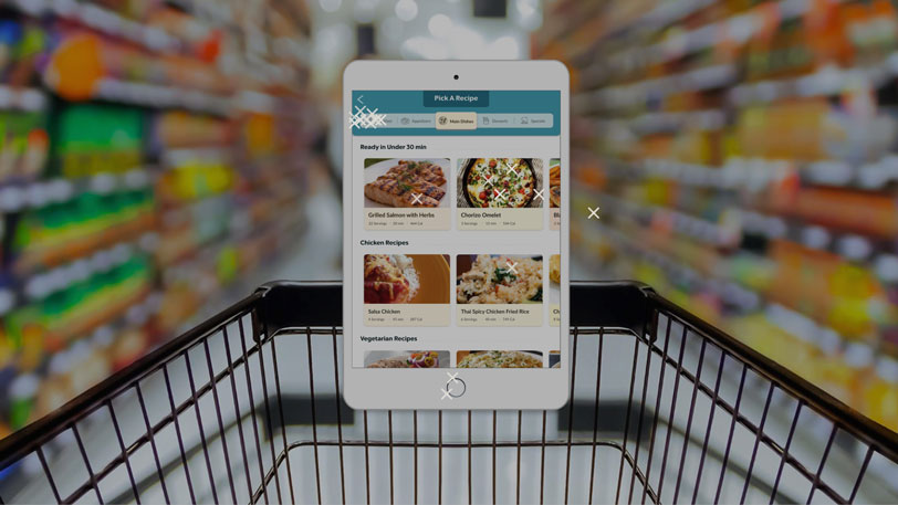
Due to technical issues, we knew that to learn the most about our users we needed to test our app remotely. How can we conduct an accurate user test when the product is meant to be used on a shopping cart? We used Maze which connects with the Figma prototype I created, and measured the efficacy of the new welcome screen and interface over 50 users. Testing the most amount of users would get us more accurate metrics, and so I made the tablet look attached to a cart to try to replicate the actual experience.
.jpg)
Scale of 1-10, 50 users
would be very likely to explore this interface
(8-10)
Scale of 1-10, 50 users
found it VERY easy to explore recipes
(8-10)
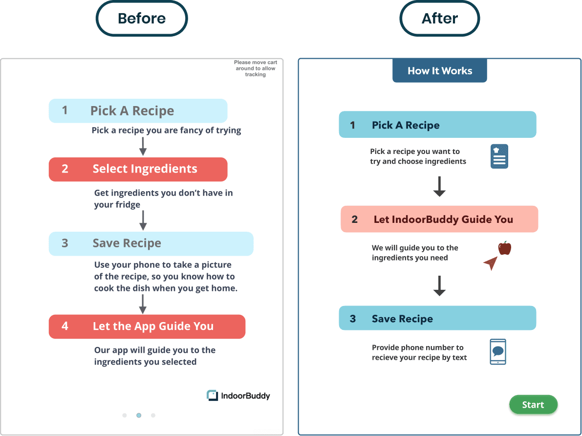
Meal Tab originally forced the user to view an overview of the experience before the actual experience. The assumption was that the features would be unfamiliar for the user, so users would "need" to measure its value from the "How it works" screen before they enter the app.
Based on the Maze data, It was clear that most users would explore the interface just by looking at the welcome screen. I made the overview screen optional, bringing customers to the experience quicker and reducing friction.

.jpg)
Our design and data helped us connect with Lauren, a regional store owner of a Gristedes in West Village. We successfully showed clear potential for increased conversion for supermarkets and an intuitive product experience that customers would love to use in store.
We were able to indicate to Lauren that we had a clear path forward, and the next step is to start testing with a variety of users in person, starting late October 2020.
Grocery store owners want to differentiate their stores and make it more convenient and valuable. Customers want to feel in control of the dizzying collection of ingredients in a store and easily find their next meal.
Successfully testing and iterating on the interface, I made considerable improvements in the appeal of our recipes, branding, and overall experience. We gained ample metrics that helped us pitch our app to store owners and target their concerns about making such an investment.
Scale of 1-10, 50 users
Scale of 1-10, 50 users
Grocery store owners want to differentiate their stores and make it more convenient and valuable. Customers want to feel in control of the dizzying collection of ingredients in a store and easily find their next meal.
Successfully testing and iterating on the interface, I made considerable improvements in the appeal of our recipes, branding, and overall experience. We gained ample metrics that helped us pitch our app to store owners and target their concerns about making such an investment.