



Project Time: 6 weeks (May 2020 to June 2020)
The Problem: Our website had no traffic and did not convert grocery store owners to request a demo of our product. We needed their buy-in to gather more data on shoppers in store and improve the experience.
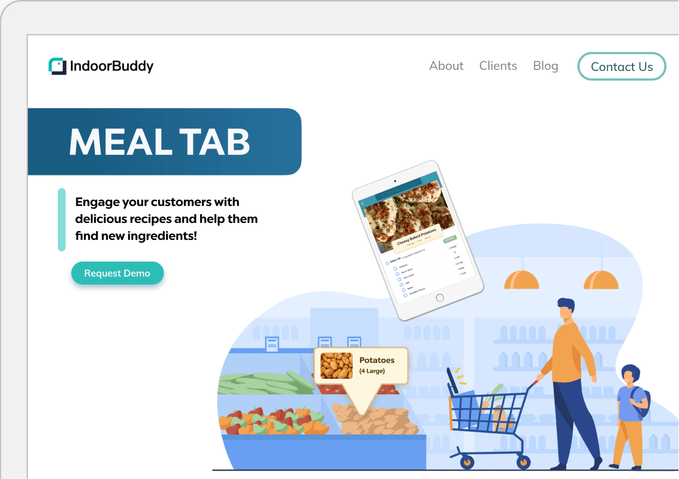
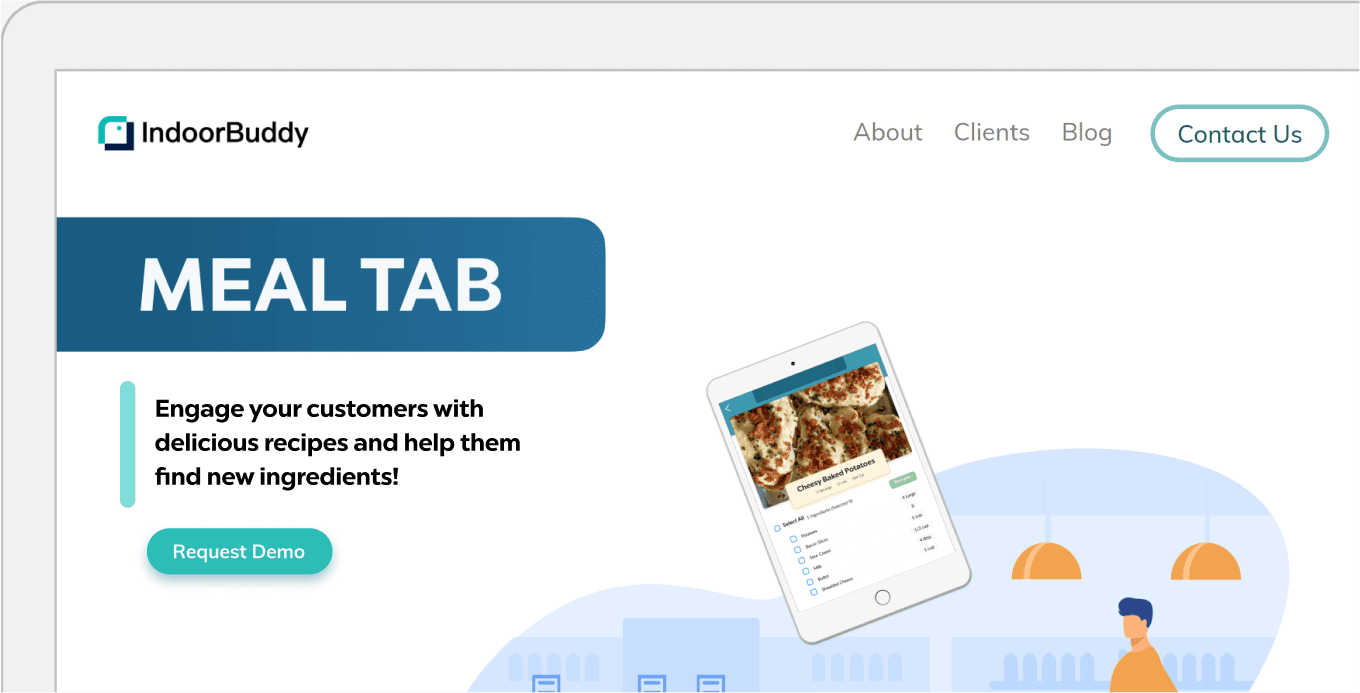
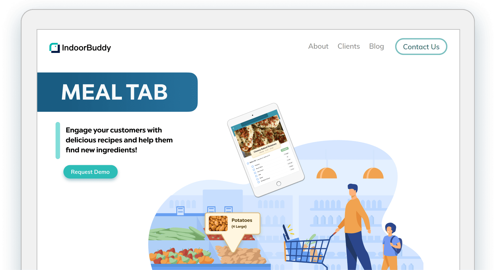
The Solution: A redesigned website that better conveys the value proposition of the product and makes it easy to request a demo.
My Role: I worked with a team of three to define goals and create new content, which helped me redesign and redevelop the website using HTML, CSS and Javascript.




In order to gain more user feedback and demonstrate positive ROI, we needed to convince store owners or managers to help us demo the product in their store for a period of time. This was the best way we can improve our current experience. We talked to Brandon, store manager of Brooklyn fare, to understand the concerns of store owners and managers with a product like Meal Tab in their store.
We discovered there were three critical ways we could improve our website. We need to make it easy for store owners to see how Meal Tab could increase their revenue. Second, they need some proof that users would actually use the product if they saw it in store. Finally, we needed to make sure we convey what our product is about as clearly and succinctly as possible.
To understand our current design issues, I started by evaluating the website based on our goals to see how well it meets UX best practices and areas of concern for store managers.
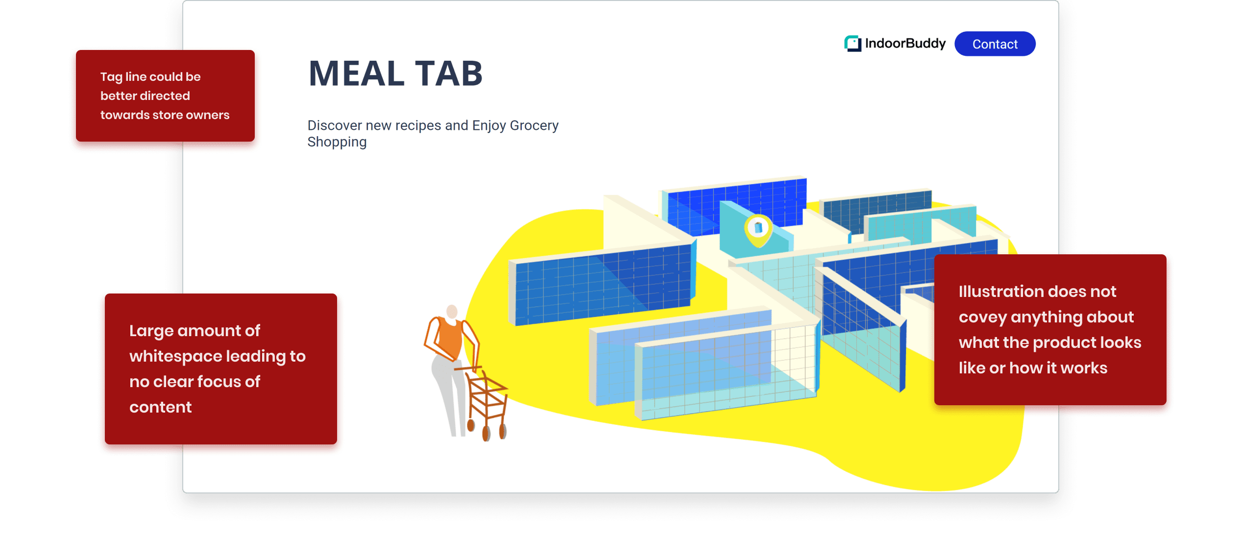
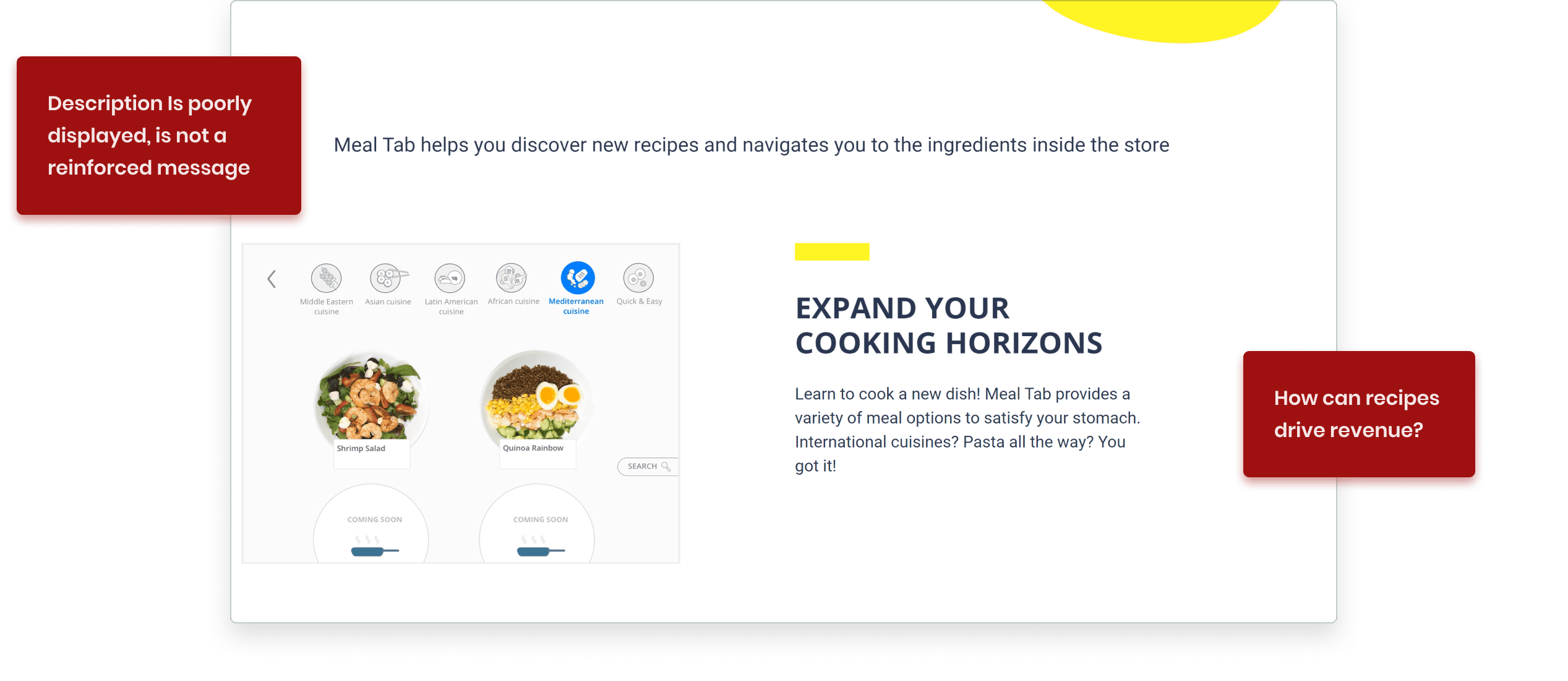
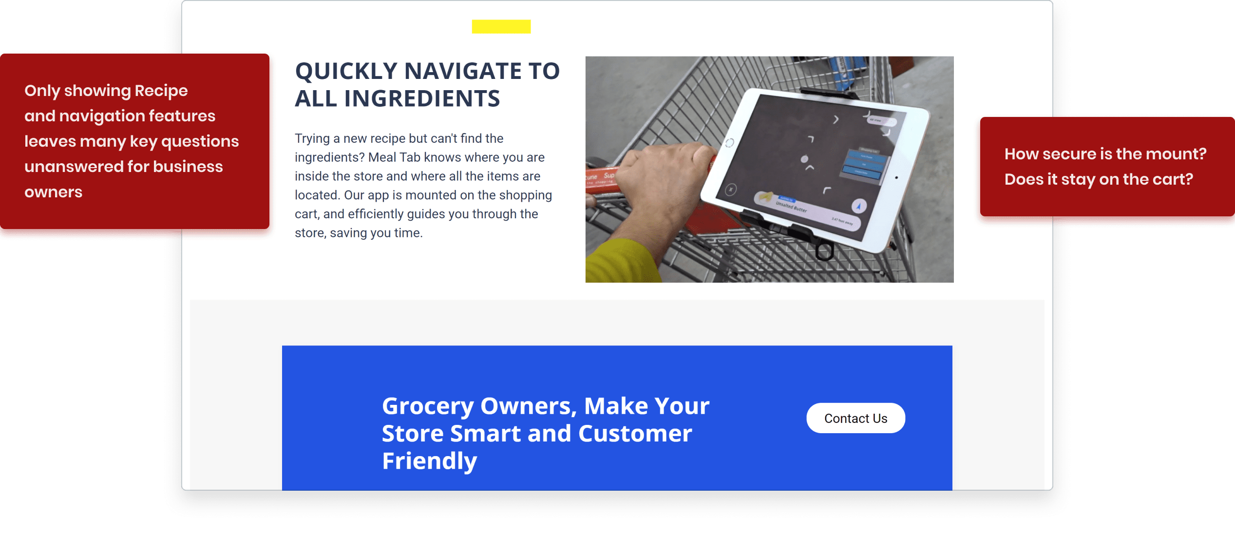
I started by evaluating our website at its current stages based on our goals to see how well it meets UX best practices and areas of concern for store managers.


Before we started iterating on the current design, we needed to explore more ways we can demonstrate the value of our product. We knew there were more ways to do so than just using animations of the product and short descriptive paragraphs. How can we best represent Meal Tab?
Brandon discussed that seeing a shopper actually use the product in store would be really helpful to know how it works. I created a short demo video for our store owner customers that frames the problem and presents our solution.
It’s important for store owners who are making an investment to have some proof of user interest to make it worthwhile. This was one of the reasons we tested Meal Tab online with many users. We were able to place these key metrics on our website helping us validate the product.
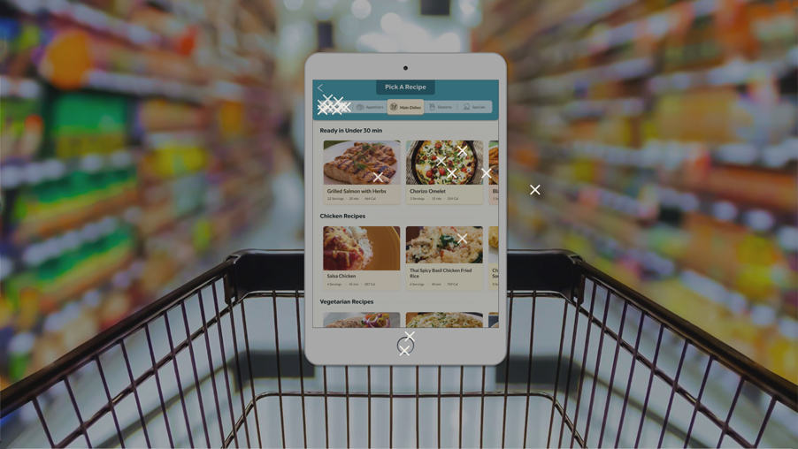

It’s important for store owners making an investment to have some proof that there would be enough user interest to make it worthwhile. This was one of the reasons we tested Meal Tab online with many users. We were able to place these key metrics on our website and make it easier to validate the product.
Scale of 1-10, 50 users
would be very likely to explore this interface
(8-10)
50 users
would switch supermarkets for this experience.
Open-Ended
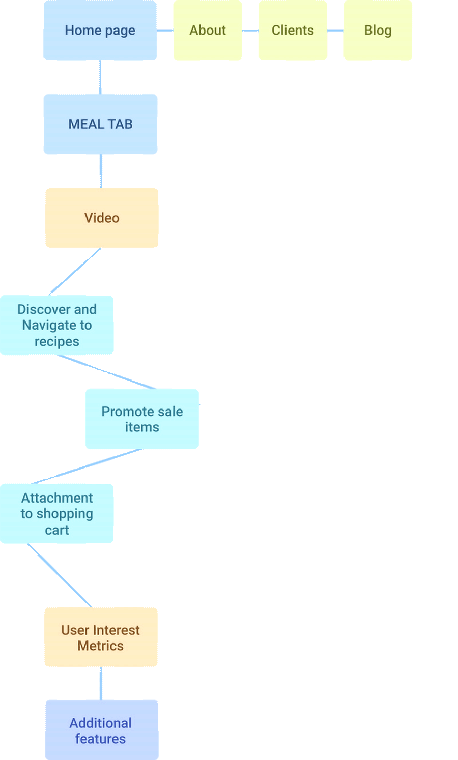
After we gathered all the useful content to improve conversion, I was able to map out a layout for the new design. I honed in on the concerns of store owners and highlighted the points in dedicated sections.
Function
Store owners need to understand what the product does. We need to make sure that it’s incredibly quick and easy to find this information.
Revenue
About 44% of shoppers look for special promotions digitally. We can convey this data to indicate that customers could purchase more sale items if they are being guided to them.
Product Mechanism
How does the overall system work? Is it an embedded shopping cart, or an attachment? How does it attach? Where would customers use it?
Given that I had only 6 weeks to get a new design developed, I decided it was best to start the redesign with wireframes based on our current design. With a clear information architecture in place, I set out to create a new design targeting the concerns of store owners while concisely highlighting the product features.
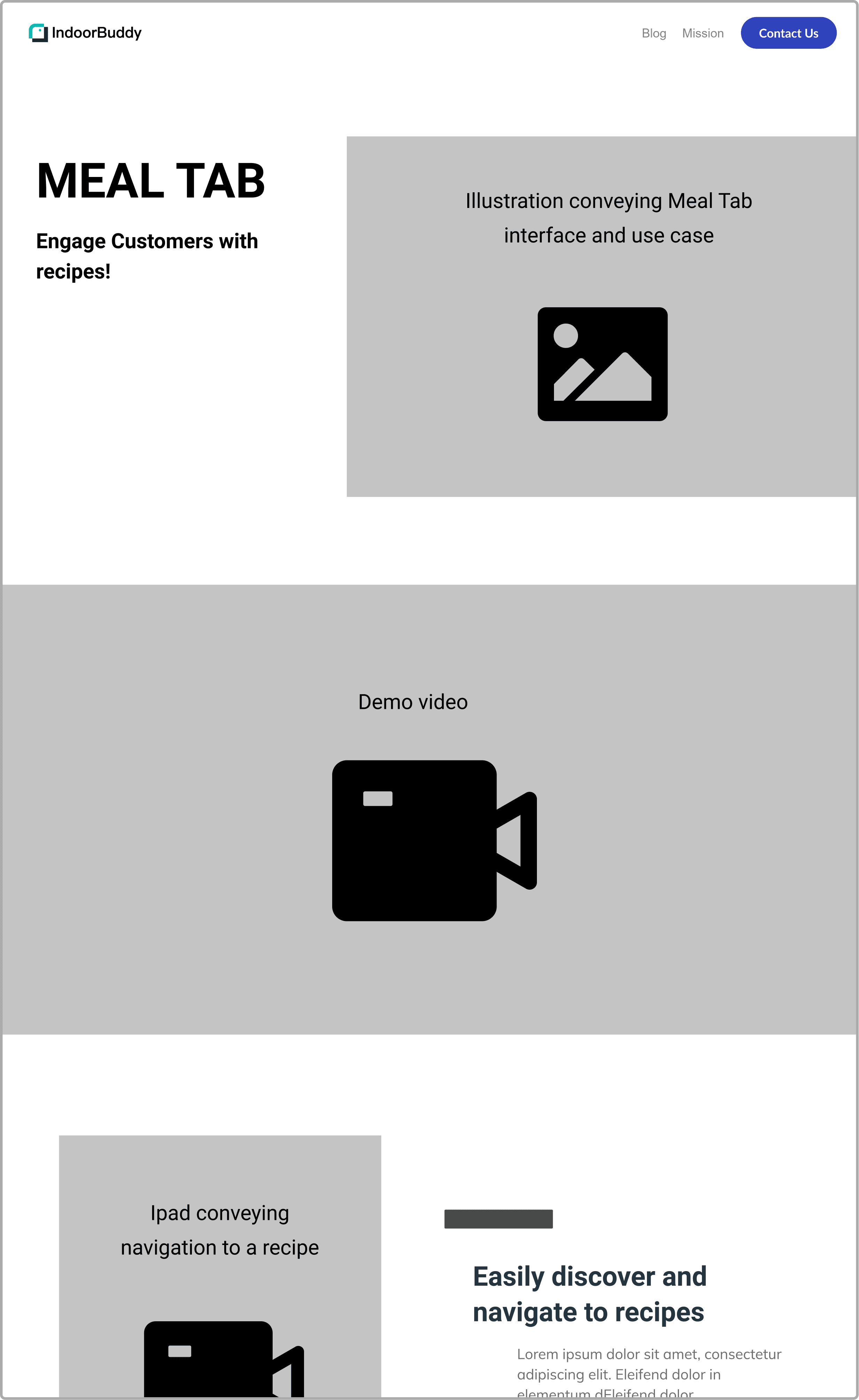
.png)
I collaborated with my team to iterate on the design and create new copy. We wanted to make it easy to request a demo, so instead of using the "Contact Us" button as a catch-all solution, I designed a clear and accessible call to action that can help us measure conversion rate. We also wanted to speak directly to their need to make more informed decisions, so we highlighted how the "Meal Tab" data can help them analyze trends in their shoppers.
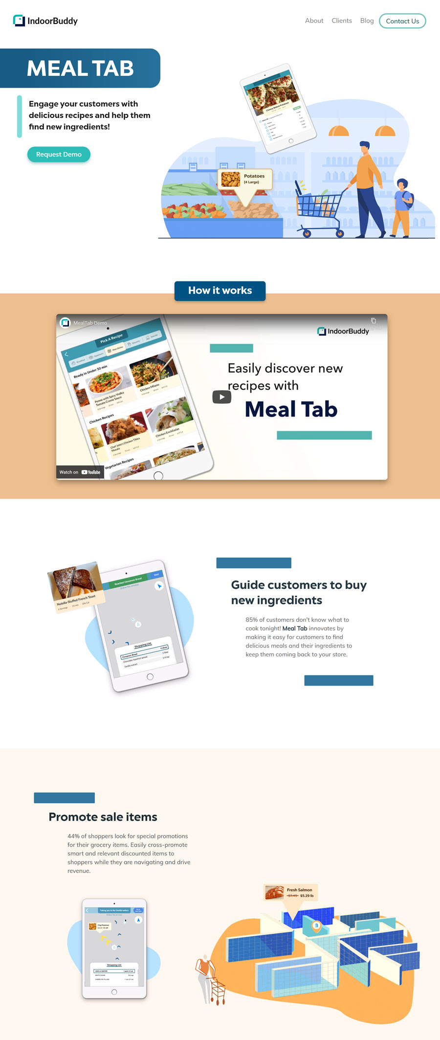
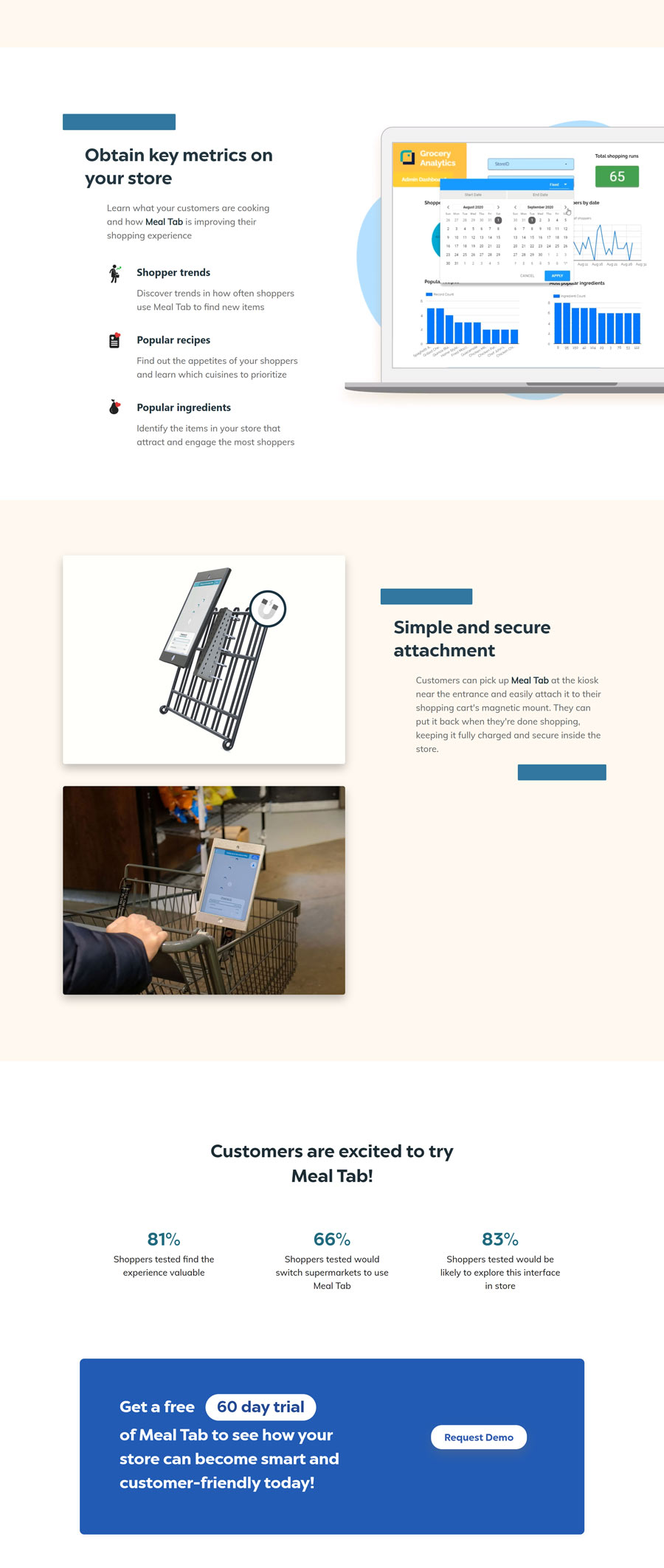
.png)
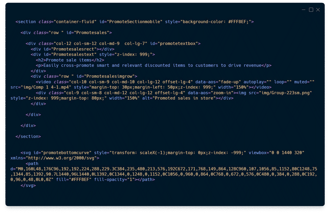
I redeveloped our website to create a more responsive design using the Bootstrap CSS framework. I also created some Javascript to play and pause the interaction video when it scrolls to it, making sure the video is seen from beginning to end. As a final touch to keep the interface feeling smooth, I used AOS javascript library to animate elements on scroll.
As a result of my work, we got a solid increase in contact emails and new demo requests! Around the World Market, one of the largest grocery stores in the tri-state area of NC, reached out to us and wanted to try our product in their store. We also got to connect with Gristedes Supermarkets and scheduled a date to start demoing with them as well.
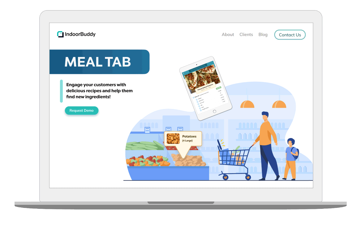

As a result of my work, we got a solid increase in contact emails and new demo requests! Around the World Market, one of the largest grocery stores in the tri-state area of NC, reached out to us and wanted to try our product in their store. We also got to connect with Gristedes Supermarkets and scheduled a date to start demoing with them as well.
25 Page visits
more emails requesting more information from 3 emails
25 Page visits
asked to try the product in person over email